2 minutes, 38 seconds
Most of the time when I’m reading articles online, I very often switch my browser to Reader View. This gets rid of all fluff of display and theme that a site’s have and, most importantly, fixes the low contrast text trend. Reader View is white text on black background (but this is configurable) and also adds a “Time to Read” at the top of the article. The latter prevents me from clicking on a “quick read” which is actually 30 min!
I noticed some times I visit a site and don’t flip in Reader View because they’ve done it for me already! While I know not everyone is like me, so they may prefer miles of white space with a nice, thin, light gray font on an off-white background. However, as this is my blog, I’ve just converted to be just as I like those sites where I don’t turn on Reader View!
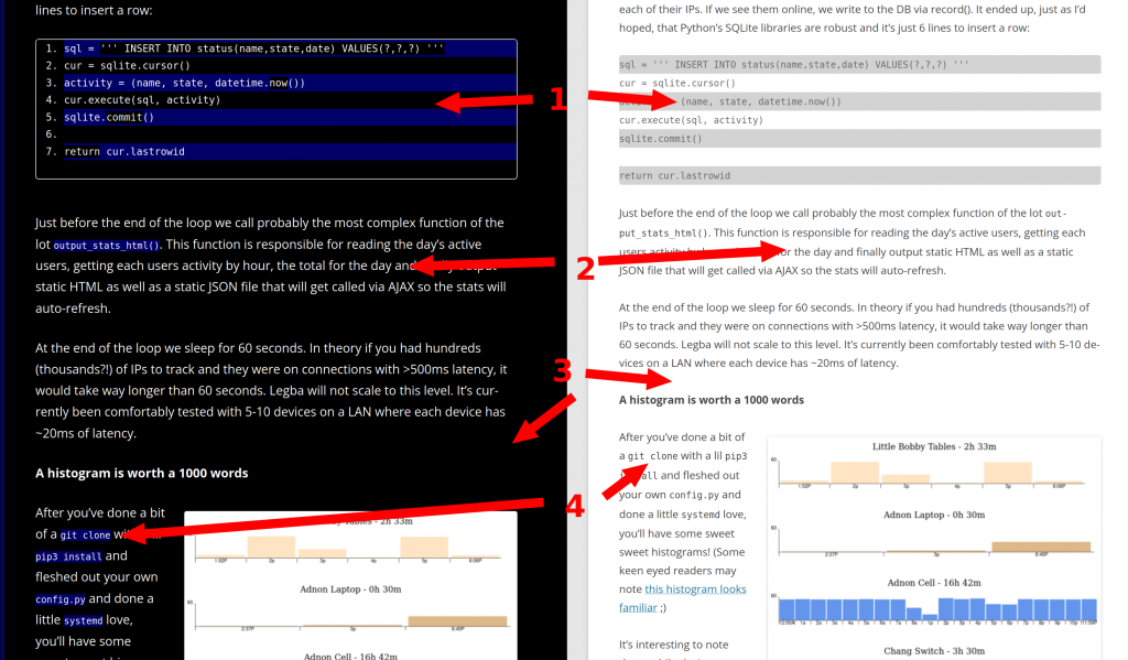
Referencing the image above, here’s’ the changes with the “before” on the right and the “after” on the left:
- All code blocks are now numbered. They’re still zebra striped, but they’re higher contrast
- Text is now larger and easier to read – straight up white on black
- White background is now black background*
- Items that are variables or code snippets have a different colored background, like
this - The read time is shown at the top of every post (not pictured)
- Removed “Share This” icons at the bottom of each post (also not pictured)
* – I actually don’t force the black background! All the changes are live based on the users’ OS preference via the prefers-color-scheme CSS selector. You can pick! Here’s a video showing the two flipping back and forth:
I’m still tweaking a few of the CSS colors and what not as I find things not quite right, but please send along any questions or comments. I’d love to hear what y’all think!
Addendum
The “Share This” plugin mentioned above was not only adding some extra clutter of icons I no longer thought too helpful, but was also including an external CSS or JavaScript or something file that didn’t feel right given I don’t prefer to share my HTTP traffic with any other sites.
As well, I removed two extensions (Share This and Code Highlighter syntax) which I then implemented in my own wee plugin. Less 3rd party code means less to update means less security concerns for my ol’ blog here. As well, I greatly reduced the feature set and amount of PHP – I think the plugin is about 5 active lines of PHP.
Finally, I’m using the Twenty Twelve theme with this additional CSS (added via “appearance” section of prefs):
#site-navigation, .comments-link {
    display:none;
}
.wp-block-quote {
    border-left: .25em solid;
    border-left-width: 0.25em;
    border-left-style: solid;
    border-left-color: cyan;
}
body .site {
    margin-top: 0;
    margin-bottom: 0;
}
body, * ,.site {
    font-size: 1.15rem;
}
body {
    background-color: white;
    color: black;
}
.wp-block-code ol li:nth-child(odd), code  {
    background: lightcyan;
}
code {
    padding: 4px 6px 4px 6px;
}
@media screen and (prefers-color-scheme: dark) {
     *,.site  {
        background-color: black;
        color: white;
    }
    .widget-area .widget a, .entry-content a, .comment-content a {
        color: #51c9ff;
    }
   .widget-area .widget a:visited,.widget-area .widget a,.entry-content a:visited, .comment-content a:visited {
        color: lightgray;
    }
    .widget-area .widget a:hover ,.widget-area .widget a,.entry-content a:hover, .comment-content a:hover {
        color: white;
    }
    body {
        background-color: #010149;
    }
    .wp-block-code ol li:nth-child(odd), .wp-block-code ol li:nth-child(odd) {
        background: #000030;
        color:white;
    }
    code {
        background: #000065;
    }
    .entry-content img, .comment-content img, .widget img, img.header-image, .author-avatar img, img.wp-post-image, .wp-block-embed {
        border-radius: 3px;
        box-shadow: 1px 2px 5px rgba(255, 255, 255, 0.84);
    }
}
With all this you should able able to reproduce these settings on your own blog if you so desire!




 As part of putting some