0 minutes, 54 seconds

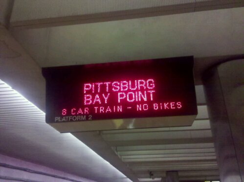
Check out this BART sign. Recently, I think, they added then bike status (none bikes during rush hour). Super handy! However, what is not so handy is the rest of the sign info. A bit ago the signs started to show when say the next two Fremont trains we’re coming :
Fremont 1min, 21min
This is not helpful. What is the use case of you standing on the platform and needing to catch a Fremont train but not the very soonest one? Right, none really, or edge case at best.
I think what would be useful would be to always have the next train arriving at the bottom of screen. Even better would be to go all CNN and have a news ticker style of the next trains. This would alleviate waiting for all the “cameras are not a guarantee against crime ” messages to scroll by while you wait to see when your training is gonna arrive.
I spent a few minutes under a sign trying to count how many pixels there is to work with, but my train came too soon. I did see that there is about 9×5 per letter at the smallest font size. Any designers out there wanna take a crack at a redesign?
hmm. i felt that the move to “Fremont 1min, 21min” was an improvement – even though the second time is sort of useless, they *used* to scroll those two data points as two separate lines.
so, maybe you’re at montgomery and you want to go to richmond, sometimes you’d see a scroll like this:
fremont 1 min
pittsburgh 4 min
fremont 5 min
dublin 6 min
fremont 7 min
pittsburgh 9 min
richmond 15 min
you had to wait a long time to get info on your train. lame! now you have to wait for at most 4 lines to scroll to see your train, since they’ve compressed the time display
unless there’s something better that they could do with the space used up by the second ETA, i’m not sure it’s worth changing it…
next train always on the bottom is a fantastic idea and/or a scroller on the bottom with next train always. damn straight.
I think the 2nd time could be useful if the first train is super crowded you can decide how long it is worth waiting to be on a train that might or might not have a bit more breathing room.
Wangston and Justin – Good point about the compressing of data. My sweetie also pointed out that the second time is good during rush hour. If the train is packed silly, you know how long ’til the next, less crowded train will be, like Justin said.
My main point is that I want to know when the next train is, always.
here’s the offical bart.gov post:
http://sfbart.posterous.com/new-bike-info-added-to-electronic-platform-si
Huh who knew BART had an (unofficial) blog! Also, I found a picture on flickr that is hi-res enough to count the LEDs. With the resolution of the sign, we could propose a different arrangement that would actually fit. Stay tuned!